TRIAL.  |
| First, I imported the photo I took of my sister and imported it into Pixlr as a new layer. |
 |
| I then changed the colour effect to "old photo". By adjusting the contrast and brightness, and the saturation and lightness I was able to make one side of her face darker than the other. |
 |
| Adding another layer, I used the burn tool to make her eyes completely black. Using the "bulge" tool I then expanded her eyes so they were abnormally larger. |
 |
| On another layer, using the "smudge" brush tool; i added marks on the lower eyelids portraying strain/ruin of the skin. I also added a slight hint of the colour red on the insides of the eyes. Then using the brush tool, colour black, I darkened the background all around her face. |
 |
| By changing the size of the document I made it into poster size. I then added my typography at the bottom of the page. Using the 'burn' tool, I darkened the skin around the lips, and the lips themselves making them look more bruised and dirty. ACTUAL (TEASER) DRAFT.  Using another photo of my sister (one more fore-front) I imported it into pixels.    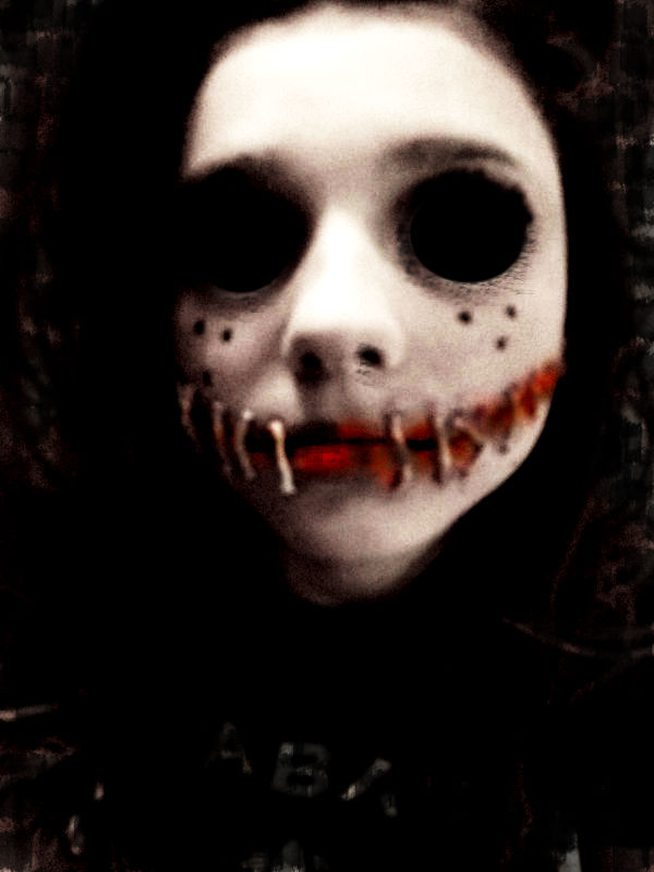  Adding a new layer, I imported my typography and crop it to where I wanted it to be. Using the brush tool I blended it into the background and then, changing the colour to white and using smudge, added the effect on top of my typography. I did this so the page looks more faded and creepy.  
I then added the slogan to my poster. I decided to position is just above/next to the head of the image on my poster as that is where it is most likely to catch people's attention. I think having the words 'it' in the slogan and then positioning next to the mysterious face; allows the intended audience to make the connection that, that face is the 'it'. This then adds more of a creepy/fearful atmosphere as the audience would then feel even more (in a sense) 'watched' by the creature on the poster.

After, I added the release date onto the poster in the same font as the slogan - Gigi. On another layer, using the simple brush tool (colour black) I faded on the typography slightly on both the date and the slogan to give off more of the 'old and worn out' feel. Then on a last layer, using the crack brush tool I went over some of the fonts again for more specific fading of letters.

Finally, using the brush tool on the option "smudge", in the colour grey, I added an effect around some areas on the edges of the poster. I did this (mainly randomly) so that the page would look old, and as if some parts are beginning to fade away. This helps relate to the film firstly being set in the 1960's. Therefore the context of the film originates historically - so, it is important that I create my poster to include features that will satisfy the expectations of my target audience. The fading around the edge of the poster also relates to damage - damage of the poster/refers to damage of the teens and the 'Human Puppet' itself. I then enhanced the curves to make everything brighter are more visible, but it also made the grime/worn edges more prominent to the eye so show decay.
|
No comments:
Post a Comment