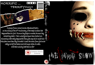
Once the image was set onto the template the way I wanted, I began to edit. Firstly I adjusted the hue and saturation so that the image was almost completely black and white. Then, using the original brush tool (colour red, opacity 20/30) I made the mouth on the image look blood covered and sore. I then added darker areas of the mouth by using the Burn Tool. Once I had finished that, using the Bulge Tool, I enlarged the eye and completely blackened it using, again, the black brush tool. Lastly, to create the definition of the image,I adjusted the curves to create a more 'cartoon' finish.
Then, I re-opened the same image but instead, I cropped a small section of skin out of it to fill in the missing area in the top corner. Once I cropped the skin out, I adjusted the hue, saturation and curves to get the correct lighting and colouring to match the rest of the face.

Next I added my original typography to both the front and down the edge of my DVD cover. I used the same typography so that the connection could be made between each of my campaign posters and the DVD cover. I then added any relevant logos/signs, e.g the 15 age rating, 4-star rating and the bar-code. Once that was done, I wrote the blurb for my DVD cover on powerpoint (Bradley Handwriting, Bold) and also the "horrific" and "terrifying" typography at the top of the back cover. I then went onto added my images I had taken, I kept the colour in the them for the contrast of the colour and darkness of my DVD cover; I edited and shaped them to fit in with the effect created. This makes the cover look less ordinary and more creative.
Fially, I added my small print onto the bottom of my DVD cover along with 3 more DVD logos that are commonly found on actual DVD cases.
Feedback I was given said that the main image of my DVD cover was too similar to my teaser poster. I was told that if I changed the image but still made them all link together it would be more effective, therefore I decided to re design my DVD cover.
I crop the DVD template so that I was left with my original DVD back.
Using the original DVD template that I had, I used the 'fill tool' to make the DVD front black. I then added the DVD back onto the template to set out the structure.
Using an image I originally taken, I cropped and imported it into Pixlr so that I could edit it to look like a bloodstained/ruined marionette.
I moved the marionette image onto my original DVD cover so that I could begin cropping and editing. Firstly, I used the wand tool, lasso tool and the eraser to remove the background from the image. Once I had done that, I adjusted the saturation, hue and curves to create a darker, dirtier looking wooden structure. I went over the string with the brush tool (light brown, opacity 35) so that the string was more defined once everything was finished. Using the pencil (sketch, opacity 100), I added, and adapted on original, cracks in the wood for more definition. Lastly, using the brush tool (colour red, opacity 27) I went over certain areas of the string too give a bloodstained look - using the burn tool and brush (black opacity 20) I went back over the red areas to make them look older.
I finally added my typography onto the poster.
|


No comments:
Post a Comment