Thursday, 11 February 2016

Main teaser draft - tweaked/final.

I took my teaser poster draft that I originally created and imported it back into pixlr. I removed the smudge effect, typography, and slogan so that the background was back to completely black again. I then centred the face so it was more of the main focus and in eyes view completely. Using the curves, I made them darker at the bottom and lighter at the top to get the correct lighting effect; I then completed that edit with the "sharpen" effect. Using the black brush tool on "Opacity/30" I faded the edges of the face more into the dark background to merge them together.


After that, I zoomed right in onto the eyes of the face. I did this so that using the brush tool (crack), colour red, I was able to add cracks onto the skin/lid under the large eyes. Adding these red cracks, on top of the strain marks, it adds more of a sense that the puppet is dangerous/evil. I also added a slight red tint to the edges of her eyes to imply damage and ruin - as if bruised or bloody.


This is my original typography and I added this onto the poster. However, I edited the typography to make it brighter and bolder.


I used this font as it resembles handwriting quite clearly more than anything else. My slogan idea 'it's got no strings to hold it down' came from adjusting a couple words in the lyrics from the Disney song 'Got no strings' in Pinocchio. I used this for my slogan as it removes the ideologies of 'Disney, dolls and toys bringing happiness' by subverting it to something quite scary and discomforting. 

I added the typography and slogan onto the poster. With the slogan, I used the brush tool (in red, on charcoal) to make the eyes of the 'i' look as if they are blood smudges. And with the typography, I used the white brush tool to go over the original letters to make them brighter and bolder.


Lastly, I added the date to the poster.

Tuesday, 2 February 2016

teaser poster.


TRIAL.

First, I imported the photo I took of my sister and imported it into Pixlr as a new layer.
I then changed the colour effect to "old photo". By adjusting the contrast and brightness, and the saturation and lightness I was able to make one side of her face darker than the other.
Adding another layer, I used the burn tool to make her eyes completely black. Using the "bulge" tool I then expanded her eyes so they were abnormally larger.
On another layer, using the "smudge" brush tool; i added marks on the lower eyelids portraying strain/ruin of the skin. I also added a slight hint of the colour red on the insides of the eyes. Then using the brush tool, colour black, I darkened the background all around her face.
By changing the size of the document I made it into poster size. I then added my typography at the bottom of the page. Using the 'burn' tool, I darkened the skin around the lips, and the lips themselves making them look more bruised and dirty.


ACTUAL (TEASER) DRAFT.


Using another photo of my sister (one more fore-front) I imported it into pixels.


Once it was in pixels I changed the colour effect to Old Photo. Using "curves" I adjusted them, making the edges darker but her face paler. Using the brush tool I darkened her whole eye to black, then using the bulge tool I enlarged them to an abnormal size. Making her look slightly possessed. Then using the burn tool, I darkened the skin and lips of her face making the look more bruised and dirty.


Using the brush tool on smudge, I added marks on the inside (near bridge of nose) and on the lower eye lids. This makes the skin look stretched and strain.


Using the sponge tool, I made the lips (and skin surrounding) red to represent the blood that would be on the face of the puppet due to the ripped and sewn face. By adjusting the "curves" again I made her face another stage brighter and the surroundings darker to make the features of her face more prominent.


I then darkened the background so that the face was the complete main focus. But, I didn't use a "block" black brush to hide the background, I used a smudge tool so that not every single part of the background was hidden; there is still (even though small) parts visible. I did this to make it look worn and old, rather than too unrealistic.

Adding a new layer, I imported my typography and crop it to where I wanted it to be. Using the brush tool I blended it into the background and then, changing the colour to white and using smudge, added the effect on top of my typography. I did this so the page looks more faded and creepy.

I then designed my slogan typography. The font I chose to use was 'Gigi' as it resembles more of a (childlike) scribble rather than actual font/handwriting. I added a slight grey shadow/glow around the edge of the font. The actual slogan itself is a twist on the Disney Film 'Pinocchio' the puppet, and the song he sings 'Got no strings'. I did this because puppet shows usually have a younger target audience, so using the Disney lyrics will have connections to other people. The original lyrics are "I've got no strings to hold me down"; however I change them to "it" as it adds the enigma of who and what the story line is based upon - it leaves it to the imagination of the audience.


I then added the slogan to my poster. I decided to position is just above/next to the head of the image on my poster as that is where it is most likely to catch people's attention. I think having the words 'it' in the slogan and then positioning next to the mysterious face; allows the intended audience to make the connection that, that face is the 'it'. This then adds more of a creepy/fearful atmosphere as the audience would then feel even more (in a sense) 'watched' by the creature on the poster.

After, I added the release date onto the poster in the same font as the slogan - Gigi. On another layer, using the simple brush tool (colour black) I faded on the typography slightly on both the date and the slogan to give off more of the 'old and worn out' feel. Then on a last layer, using the crack brush tool I went over some of the fonts again for more specific fading of letters.


Finally, using the brush tool on the option "smudge", in the colour grey, I added an effect around some areas on the edges of the poster. I did this (mainly randomly) so that the page would look old, and as if some parts are beginning to fade away. This helps relate to the film firstly being set in the 1960's. Therefore the context of the film originates historically - so, it is important that I create my poster to include features that will satisfy the expectations of my target audience. The fading around the edge of the poster also relates to damage - damage of the poster/refers to damage of the teens and the 'Human Puppet' itself. I then enhanced the curves to make everything brighter are more visible, but it also made the grime/worn edges more prominent to the eye so show decay.

Thursday, 28 January 2016

Main Image Choices - To Edit.

These are the main images that I have chosen to attempt to edit because my Teaser Poster is mainly the darkened face of the Human Puppet. All of them are pretty close up, however a couple of them are less close up giving me a wider range to edit.


There is different lightings from the top photos to the bottom. This is good as it allows me to edit them in a variety of ways; meaning that the different effects will have different impacts on the image - making it even scarier/more mysterious etc. 


Development of Human Puppet.

I began to develop the face of my Human Puppet character to edit on Pixlr for my posters. To start, I used Baby Talc to make her face paler than usual.

I then used bronzer to make the cheeks a bit dark than the rest of the face. This makes the cheeks and the whole appearance slimmer.

To begin the mouth; I used black eye-liner to sketch a line. I then used brown and black eye-shadow to dab on and around the line; making the face look bruised and dirty. Using red paint, I then put 6 dots on her cheek - 3 on top of the line, and 3 beneath. I the repeated the eye-shadow.


Once that was complete, I cut pieces of string to fit the length of the dots and using glue I attached them all. Some straight and some crossed. 
I repeated this on the other side of her face. (Less stitches so it does not look overly precise). 
Both side of the face were then completed. I added eyelashes onto one of the eyes firstly just as an attempt. Using black and red paint, I coloured the string to look dirty, old and bloody.


Lastly, I added the other set of eyelashes to the other eye. Using the eye-liner again, I added the stereotypical "dolly" freckles on to her cheeks. I also lined her bottom eyelids with eye-liner to suit the "1960's" make up style.


Thursday, 21 January 2016

Mock-Up Poster Ideas. Pt 1 - own images and internet.

In my poster mock-up, I used a photo from my phone that I took myself (Dismaland 2015). I added it into Pixlr.com


I then cropped the image in Pixlr to make the main focus the Building and the Ferris Wheel. I then firstly edited my image by changing the colouring to "Old Photo" and adjusting using the "Brightness and Contrast".
I then added a layer onto the image. I did this so that I could add other edits and easily change them without undoing the whole thing. In this layer I used the brush tool/crack effect to add cracks onto the front, side and bridge of the building. This then made the building look more neglected and old, rather than new (like it actually was).
Using an image off of the internet for the time being, I cropped a young girl so that only the top half of her body was left. 
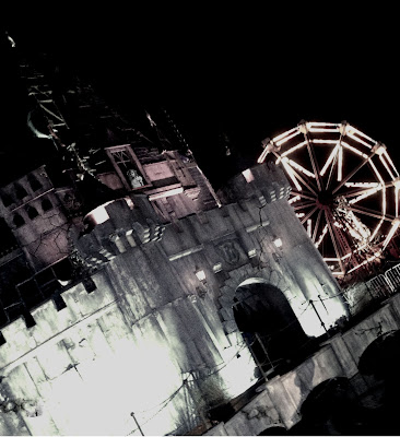
After I finished cropped the girl, I added my 2ND layer. I then added the cropped out, young girl on my image. I used "free transform" and "free distort" to fit her properly into the window of the building. Even though she is not very noticeable and does not play a large part in the image, it adds to the atmosphere that someone is always watching. 
On my 3RD layer, I used the ordinary brush tool in the colour black to remove the top section of the original (castle) to make into a smaller size of a building. This effect also makes the building look less "together". In addition to this, on this layer I made the 'old photo' effect darker again; portraying the idea in my script that there was not much light.
Finally, I added my last layer which was so that I could add the title of my horror film. Once i added the title onto the main image, I changed it colour effect to 'old photo' to match the rest.
Mock-Up Teaser Poster 2.
Using the internet, I researched horror posters of my sub-genre to get a few ideas. Considering the setting on my "human puppet" is in a mysterious, down room - I decided to find a "grunge" picture of a wall and floorboards.
Once I inserted the picture into Pixlr; using the filters I changed the effect of the photo to "old photo" to firstly represent the time era (1960s) and to represent the abandoned atmosphere.


Again, on the internet I found and saved an image of a window and using pixlr I cropped the image so it was just the frame. I also put cracks using the brush tool in two corners of the window frame.

I then (on another layer) added the cropped frame onto the grunge wall background. Using the black brush tool, I went around the edges of the frame to give it a minor shadow. Also using the "dirt" brush tool I added smudges onto the "window pane" to look as if the glass was ruined.
I then researched "street lights  to find an image I could use for "outside the window". On Pixlr I cropped the image down the size. I used street lights as in my script "the mysterious room" has no other lighting than the street lights through the cracked window.


Adding another layer, I used "free transform" to change the size of the image to fit behind the window frame. Using the blur tool, I blurred the image of the forest to make the window look as if there is actually glass there.
I then used a crack effect to make it seem as if the glass had been smashed due to the decay and neglect of the room. 

Tuesday, 19 January 2016

Typography Mock-Up


My first font that I chose was Bernard Condensed. Once I imported it into pixlr, I added another layer onto the font. On the layer, I used the brush tool to add smudges onto the font making it look old and worn.


I then added another layer. On this layer, I used the "dirt" brush tool and added an effect onto the corner of the typography. I did this so that when on the page, it would have a whole neglected effect.
My second typography mock-up font is "Party LET". I used this font because the curls and flicks on the font looks child like. However, the rigid/shard edges on some of the letters makes it look creepy.
On powerpoint, I used the "glow" effect so that around the edges of the white font, there is a darker colour "glow" around the outside.
I added another layer onto the typography. On this layer, I used a normal brush tool in the colour red to make the bottom of the layers have a sort of faded/red colouring to them. I also used the "smudge" brush tool in red to add a red/blood smudge onto the tall part of certain letters.
On my second layer, I used the crack tool to add a minor effect on top of the typography in the colour red. I added the effect mainly over the work "puppet". Firstly, as the image portrayed to the audience, of the puppet, is rather gory. And secondly, due to the deaths of 2 groups of teens - blood.

Wednesday, 13 January 2016

Script


From researching the generic conventions of a horror-genre script, and by researching into my target audience - 
finding their likes, interests and most preferred horror features - I was able to write my script to best fit. 
(both the genre and my audience). I have based this script on 2 groups of teens, one of the groups who begin 
the horror script in 1960s. And the second group who finish it, in present day 2015. The sub genre of my script is 
"Killer Toy", as one of the most popular sub-genre's in my questionnaire was "other". Therefore, by basing my 
script on "killer toy" I aim towards the less common Zombie, ghost or psychological sub-genre. 
I also believe from research, and experience, that even though it is not real, the ideology of a child's
 toy being possessed makes the audience sub-consciously worry and fearful of the things around them 
- having a larger impact.